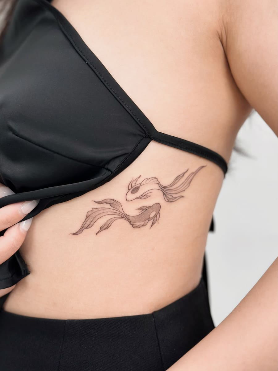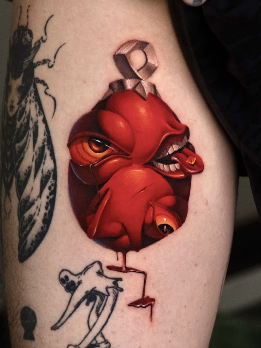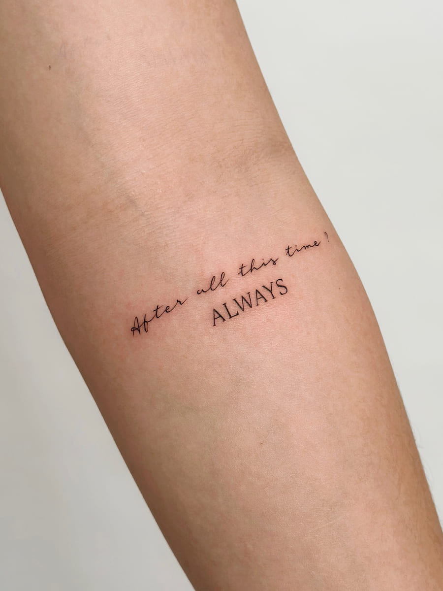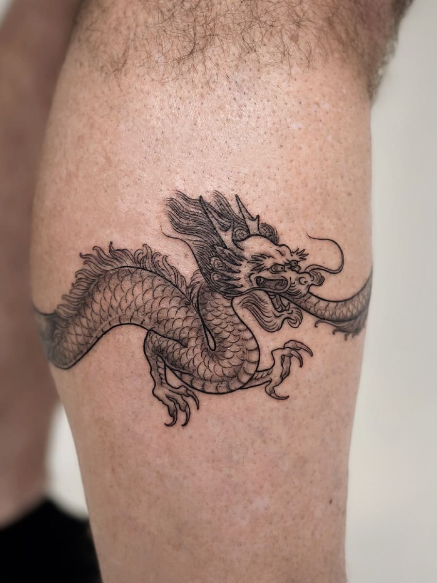

Libra is the only zodiac sign represented by an object rather than a living thing. The scales stand for balance, fairness and considered judgement, and the glyph (♎) is a stylised version of the same idea: a horizontal base with a curved arc above it, often read as the sun setting on the horizon.
That object-based symbolism creates a design problem unique to this sign. A tattoo about balance that sits crooked contradicts itself. This guide covers the four design approaches, the sizes each needs, and why placement matters more for Libra than for any other zodiac tattoo.
What Libra Stands For
| Attribute | Meaning |
| Symbol | The scales: balance, fairness, weighing choices carefully |
| Element | Air: intellect, communication, clarity of thought |
| Ruling planet | Venus: beauty, art, harmony, connection |
| Modality | Cardinal: an initiator, someone who starts things |
| Dates | Roughly 23 September to 22 October |
The Venus connection explains why Libra tattoos skew toward refined, precise, visually balanced work rather than bold or chaotic styles. People drawn to this sign tend to want something that looks considered, which in practice means fine line, geometric or ornamental rather than heavy traditional.
Why Placement Matters More Here
Both the glyph and the scales are horizontally symmetrical designs built on a level baseline. That is unusual among tattoo subjects, and it creates two specific risks.
- Bodies are not level. A stencil applied flat to a curved forearm, a sloping collarbone or an off-centre spine will read as tilted once the limb is in its natural position. The eye registers a tilted horizontal line instantly, far faster than it registers a tilted flower or animal.
- The subject makes it worse. With most designs a slight tilt reads as character. With a set of scales it reads as the scales being unbalanced, which inverts the meaning of the tattoo.
What this means practically: spend real time on the stencil. Check it standing, not lying down. Check it in a mirror yourself, from the front, with your arm relaxed at your side rather than held out. An artist who repositions a Libra stencil four or five times and asks you to look again is doing exactly the right thing.
Experienced artists will sometimes build a slight deliberate tilt into the drawing so that it reads level on a curved surface. If yours proposes this, it is a sign of competence rather than carelessness.
Four Design Approaches
1. The glyph
The ♎ symbol alone: a horizontal line with a second line above it carrying a central arc. Minimal, discreet, and recognisable to anyone who knows the sign while reading as abstract to everyone else.
This is fine line or dotwork territory. The technical demand is consistency: two long parallel horizontals have nowhere to hide an uneven line. Any wobble or variation in needle depth is immediately visible because the eye compares the two lines directly against each other.

2. The scales
A literal set of balance scales, from a simple silhouette through to an ornamental version with floral or gemstone detail. More expressive than the glyph and more demanding, because the design has a lot of thin structure: the beam, the chains or arms, and the two pans.
Those chains are the element that fails first at small sizes. A chain rendered as a series of tiny links closes into a solid line as ink settles. If you want visible chain detail, the piece needs real size; if the space is limited, ask for the chains simplified into clean single lines from the start. See ornamental work for the decorative versions.

3. The constellation
Libra’s stars rendered as dots connected by fine lines, sometimes with moon phases or the Venus glyph alongside. Reads as astronomy rather than astrology, which suits people who want the reference without the horoscope association.
Dot spacing is unforgiving here. Uneven gaps between stars are far more visible than an uneven line, because there is nothing else in the design to distract the eye. This belongs with a dotwork or fine line specialist.

4. Combined and personalised
The glyph set among flowers, scales holding two meaningful objects, or the symbol paired with script, a date or another zodiac glyph. This is where the design stops being a stock symbol and becomes yours.
One composition rule: the glyph should stay the anchor. When decorative elements grow larger than the symbol, viewers stop reading it as a Libra piece and start reading it as flowers with lines through them. See illustration work for how supporting elements are balanced.

Size Guide
| Version | Minimum size | What fails below it |
| Glyph alone | 3 cm | The gap between the two horizontals closes; it reads as one thick line |
| Constellation with connecting lines | 5 cm | Dots merge into the lines joining them |
| Simple scales silhouette | 6 cm | Beam and pans lose separation |
| Scales with visible chains | 10 cm | Chain links close into solid lines |
| Ornamental or floral scales | 12 cm and up | Decoration crowds the structure |
| Glyph with script or a date | 7 cm and up | Lettering closes up faster than the glyph does |
The glyph is the version most often undersized. Below about 3 cm, the space between the two horizontal lines is the first thing to close, and once it does the symbol stops reading as Libra at all. Because most studios apply a minimum charge regardless of size, going slightly larger usually costs nothing. Ranges are in our price guide.
Placement
| Placement | Suits | Alignment risk |
| Inner forearm | Glyph, constellation, small scales | Low. Flat and stable, the safest choice for a horizontal design. |
| Upper arm | Scales, larger ornamental work | Low to moderate. Curved, so check the stencil with the arm relaxed. |
| Centre chest or sternum | Symmetrical scales | High. The strongest placement symbolically and the least forgiving. |
| Spine | Vertical constellation layouts | High. Must be exactly centred and vertical. |
| Collarbone | Glyph, small constellation | Moderate. The bone slopes, so a horizontal design needs careful angling. |
| Ribcage | Constellation, trailing designs | Moderate. Skin moves with breathing. Among the more painful areas. |
| Wrist and ankle | Glyph only | Moderate. Keep line weight generous; these areas see constant movement. |

Zodiac Work at OCD Ink Studio
Zodiac pieces are among the most requested small designs at both studios, and they are almost always fine line or dotwork, which is the discipline OCD Ink Studio is built around. The reel below covers zodiac work from our Hanoi studio.
Four specifics worth knowing:
- Artists assigned by specialisation, not availability. Fine line glyph and constellation work goes to fine line artists; ornamental and dotwork scales go to artists in those registers; colour and realism to Mike. Founder Dino specialises in graphic and fine line and won Best of Day in the Black & Grey category at the Vietnam Tattoo Convention 2020. Full team on the artist page.
- Healed results published openly in our healed gallery, which is the only honest way to judge whether thin parallel lines stayed even.
- A two-year touch-up warranty, which matters most for exactly this kind of small fine line work.
- Two studios and a complimentary protective film. One in Hanoi’s Old Quarter, one near Hoi An Ancient Town, with English-speaking consultation and a second skin film for the first 72 hours.
Send your reference with a size in centimetres and a placement, or book in Hanoi or book in Hoi An.
FAQs
What does a Libra tattoo mean?
Balance, fairness and considered judgement. Libra is the only zodiac sign represented by an object rather than a creature, which is why the scales carry the meaning so directly.
How small can a Libra glyph tattoo be?
About 3 cm. Below that, the gap between the two horizontal lines closes as the ink settles and the symbol reads as a single thick line.
Glyph or scales?
The glyph is discreet, quick and ages reliably. The scales are more expressive but need 6 cm minimum, and 10 cm if you want visible chain detail.
Where should I put a Libra tattoo?
The inner forearm is the most forgiving, because it is flat and stable. The chest and spine are strongest symbolically but least forgiving of any alignment error.
Can I combine Libra with another sign?
Yes, and pairing sun and moon signs or adding the Venus glyph is a common way to personalise it. Keep one element as the clear anchor so the piece still reads as Libra.
How long does a Libra tattoo take?
A glyph takes 15 to 30 minutes, though the appointment runs closer to an hour with stencil placement. Ornamental scales can take 3 to 5 hours. See how long tattoos take.